How effective is your social media strategy? In this day and age, social media as a referral source is more important than ever, and Shareaholic’s seamless integration with Google Analytics provides excellent insight into key metrics about how visitors are sharing your content and bringing you back more traffic and new visitors. Now, we’ve made it even easier to understand how your site is performing across the social networks with the Shareaholic Social Dashboard, a free custom dashboard template for Google Analytics.
This template tracks a number of different social media metrics and dimensions including:
- traffic from social sources
- which social networks are driving the most traffic to your site
- top pages referred from social media
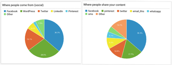
- where people are sharing your content
- … and more!
To get this custom dashboard for yourself, just click on the link below and following the instructions (you must be logged into Google Analytics and have admin level permissions for this to work)
Get the dashboard! »
Shareaholic + Google Analytics.
By default, the Shareaholic Social Dashboard looks like this, but you can rearrange all the different charts and graphs to focus on the numbers that are most important to you —
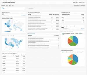
You can even tinker with the metrics to gain insight into the data that you care about.
The Shareaholic Social Dashboard was designed to help you, as a site owner, to identify how to maximize your site’s performance on social media. In order to do so, we focused on building graphs to help answer key questions that will drive your approach to optimizing social media performance.
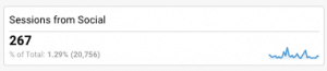
How is my site doing on social media in general? How dependent am I on traffic from social media?
A broad question, but a very good place to start. The “Sessions from Social Media” metric shows how many total users to your site were referred by a social source, and what percentage they are of your total site traffic.
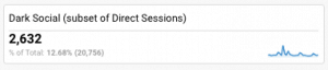 But that doesn’t paint the whole picture. The “Dark Social” metric measures the subset of people who arrived at your site via another type of social sharing that’s often missed by Web Analytics programs, like links shared via online chat or email. This can be a huge source of traffic – The Atlantic Monthly (who coined the term “Dark Social”) reports 60% of their 5M monthly unique visitors come from dark social sources.
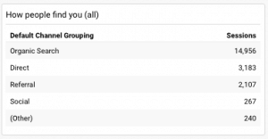
Finally, the “How people find you” table shows you where most people are coming from – whether through an organic search (like one from Google), referred from another site, or through a social source.
Which articles are succeeding on social?
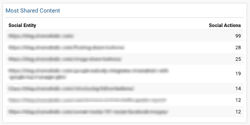
Knowing what content is popular among your audience is critical, both to help you target those articles for promotion, and to learn more about what kind of content users are responding to. The “Most Shared Content” graph shows the Social Entities (the URL that is shared via social media) with the most Social Actions (Shares, Tweets, Pins, etc).
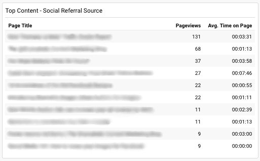
Similarly, the “Top Content – Social Referral Source” table gives insight into which pages have a high percentage of traffic coming from a social source. Comparing these two tables can give you insight into what people are sharing, versus what is bringing people to your site from social media.
Knowing this information can help you tailor your content to maximize social media reach, or determine which content to promote.
What Social Buttons should I have enabled?
To determine which social networks have the greatest impact on your site, there are a few different facets to consider. First, there are the basic raw numbers: Where are people sharing your content to, and where social traffic is coming from.
If you’re noticing a lot of people sharing content to, say, Facebook, but more users are coming from Twitter, you may want to prioritize the Twitter share button over Facebook. Similarly, if you have a LinkedIn Share Button on your page, but it seems not many people are sharing your content there, you may want to replace that button with one from another social network that’s driving more traffic to your site.
What social networks should I be focusing on?
But these numbers don’t tell the whole picture – it also matters how people are behaving once they get to your site. Fortunately, we have a graph for that too, which compares the bounce rate for each social source, as well as the average time those users spend on your site.
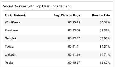
This user engagement is key, and should definitely inform how and where you invest your time. You may have a lot of visitors from Facebook, but they only spend a few seconds on your page before leaving, while users coming from Twitter are spending several minutes on your site. In this case, you may want to invest your time and energy into promoting your Twitter presence over Facebook, since those users seem to be more interested and engaged in your content.
For even greater insight, you can customize the metrics of this graph: use the Pages/Session metric to see the average number of pages a visitor from a social network visits on your site, or Pageviews to see which social networks are generating the most pageviews, while comparing how long visitors tend to stay on your site afterwards.
Social media today is more important than ever. We hope this dashboard helps you better measure and improve the ROI from your investment in social!