With a publisher network of 200,000 websites who reach 300 million people every month, Shareaholic has access to quite a bit of data. You’ve read about it before in our previous data reports, but it’s sometimes hard to grasp the full magnitude of our data set without seeing it in action.
As we are planning to go to the MIT Career Fair later this week (psst…we’re hiring), we thought it would be a great chance to give you all a glimpse into the world of big data by creating a visualization of our own. Check it out below along with a behind-the-scenes look at the data visualization process from our Data Scientist, Joseph Kibe:
What does the data visualization show?

A few weeks ago, our team tasked me with a project: whip up something interesting to show the fresh-faced folks visiting our booth at the MIT Career Fair for this week. We threw ideas back and forth until settling on something fairly simple: a data visualization summarizing the pageview data we receive.
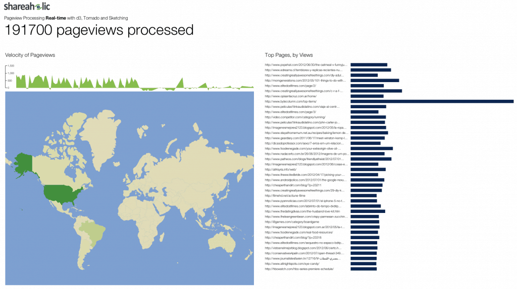
The result allows us to observe some of the state of our pageview data stream. We see, for a given window, the total pageviews processed; the velocity of pageviews over time; the density of pageviews by country; and a few dozen of the top-viewed pages across our network.
How does the data visualization work?
Unfortunately, it wasn’t feasible to hook my data visualization into our raw data stream to do a truly real-time visualization — that’s a topic for another post — but I was able to do the next best thing: stream in the raw data logs we store in S3, which weigh in at roughly a gigabyte per hour, uncompressed.
Both the streamer — the component that reads the log files — and the visualizer, which accepts the data and presents it, are written in Python. The former component is really quite simple: a script that opens, reads and parses the log file data, and then pushes it to the visualizer.
The visualizer is a bit more complicated. It uses the Tornado Web framework, which provides built-in support for Web sockets to “push” data from the visualizer server to any client browsers rendering the visualization. At one end, it accepts the pageview data as it is streamed in. The summary data is simply stored in memory, though I use count-min sketching to track the top viewed pages. The visualization layer is all done via HTML, JavaScript and CSS with a lot of help from the excellent d3.js framework for working with data-driven documents.
All of this went quite smoothly until I decided to make the new data load with some degree of elegance in the user-facing HTML, CSS, JavaScript amalgam. Doing a bit of design to present the data was not especially problematic. My many hours spent perusing art museums has done me some good. Making new data enter the page properly, by contrast, proved a relative challenge. Perhaps because it was so much more unpleasant, whether due to inexperience or by virtue of some intrinsic property of doing animations, the animation bit felt as though it took 90% of the time I spent on the data visualization.
But in the end, I pulled it out, and we wound up with something neat to show off the growing stream of data we process.
If you’re an MIT student, come chat big data with Joseph Kibe, our Data Scientist, and Robby Grossman, our Tech Lead, on Friday, September 21 at the MIT Career Fair. We’d love to meet you!
Intrigued by big data? We’re always looking for talented people to join our team! Click here to see our latest opportunities.